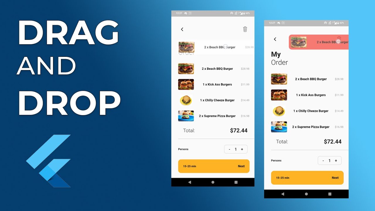
Drag and Drop functionality in Flutter allows users to interact with UI elements by dragging them across the screen and dropping them in a desired location. Flutter provides the Draggable, DragTarget, and LongPressDraggable widgets to implement these interactions. Here’s a simple guide to implementing drag and drop in Flutter:
Create a Draggable Widget
This widget can be dragged across the screen.
Create a DragTarget Widget
This widget acts as a target where the draggable can be dropped.
Explanation
- Draggable Widget Properties
- Draggable<T>: A widget that can be dragged. The generic type <T> specifies the type of data being dragged.
- data: The data that is being dragged. In this case, it’s a Color.
- child: The widget to display when not being dragged.
- feedback: The widget to display while being dragged.
- childWhenDragging: The widget to display in place of the child when it is being dragged.
- DragTarget Widget Properties
- DragTarget<T>: A widget that accepts data of type T.
- onAccept: A callback that is called when the draggable is dropped onto this target.
- builder: A builder function that provides the context, the list of data accepted, and the list of data rejected during the drag-and-drop operation.
Advanced Features
We can further customize the drag and drop interaction by using additional callbacks and properties provided by Draggable and DragTarget, such as:
- onDragStarted: A widget will call this method once dragging the widget
- onDragUpdate: A widget is giving the DragUpdateDetails class object.
- onDragCompleted: A widget will call this method on a successful drop widget in the drag target view.
- onDraggableCanceled: A widget will call this method on an unsuccessful drop widget in the drag target view.
- onWillAccept: A drag target widget will check and verify data for accepting or rejecting a draggable object in its drop region.
These allow us to manage the drag and drop states more precisely, providing a richer user experience.
Code Example
import 'package:flutter/material.dart';

void main() => runApp(MyApp());

class MyApp extends StatelessWidget {
  @override
  Widget build(BuildContext context) {
    return MaterialApp(
      debugShowCheckedModeBanner: false,
      home: Scaffold(
        appBar: AppBar(title: Text('Drag and Drop Example')),
        body: DragDropDemo(),
      ),
    );
  }
}

class DragDropDemo extends StatefulWidget {
  @override
  _DragDropDemoState createState() => _DragDropDemoState();
}

class _DragDropDemoState extends State<DragDropDemo> {
  Color caughtColor = Colors.grey;

  @override
  Widget build(BuildContext context) {
    return Center(
      child: Column(
        mainAxisAlignment: MainAxisAlignment.spaceEvenly,
        children: <Widget>[
          Draggable<Color>(
            data: Colors.blue,
            child: Container(
              width: 100,
              height: 100,
              color: Colors.blue,
              child: Center(
                child: Text(
                  'Drag me',
                  style: TextStyle(color: Colors.white, fontSize: 18),
                ),
              ),
            ),
            feedback: Material(
              color: Colors.transparent,
              child: Container(
                width: 100,
                height: 100,
                color: Colors.blue.withOpacity(0.5),
                child: Center(
                  child: Text(
                    'Dragging',
                    style: TextStyle(color: Colors.white, fontSize: 18),
                  ),
                ),
              ),
            ),

            childWhenDragging: Container(
              width: 100,
              height: 100,
              color: Colors.grey,
              child: Center(
                child: Text(
                  'Original',
                  style: TextStyle(color: Colors.white, fontSize: 18),
                ),
              ),
            ),
          ),
          DragTarget<Color>(
            onAccept: (color) {
              setState(() {
                caughtColor = color;
              });
            },
            builder: (context, accepted, rejected) {
              return Container(
                width: 200,
                height: 200,
                color: accepted.isEmpty ? caughtColor : Colors.grey.shade200,
                child: Center(
                  child: Text(
                    'Drop here',
                    style: TextStyle(color: Colors.black, fontSize: 18),
                  ),
                ),
              );
            },
          ),
        ],
      ),
    );
  }
}
Output
